How a designer created the "dirty, organic, insectoid logo" for Marvel Cosmic Invasion
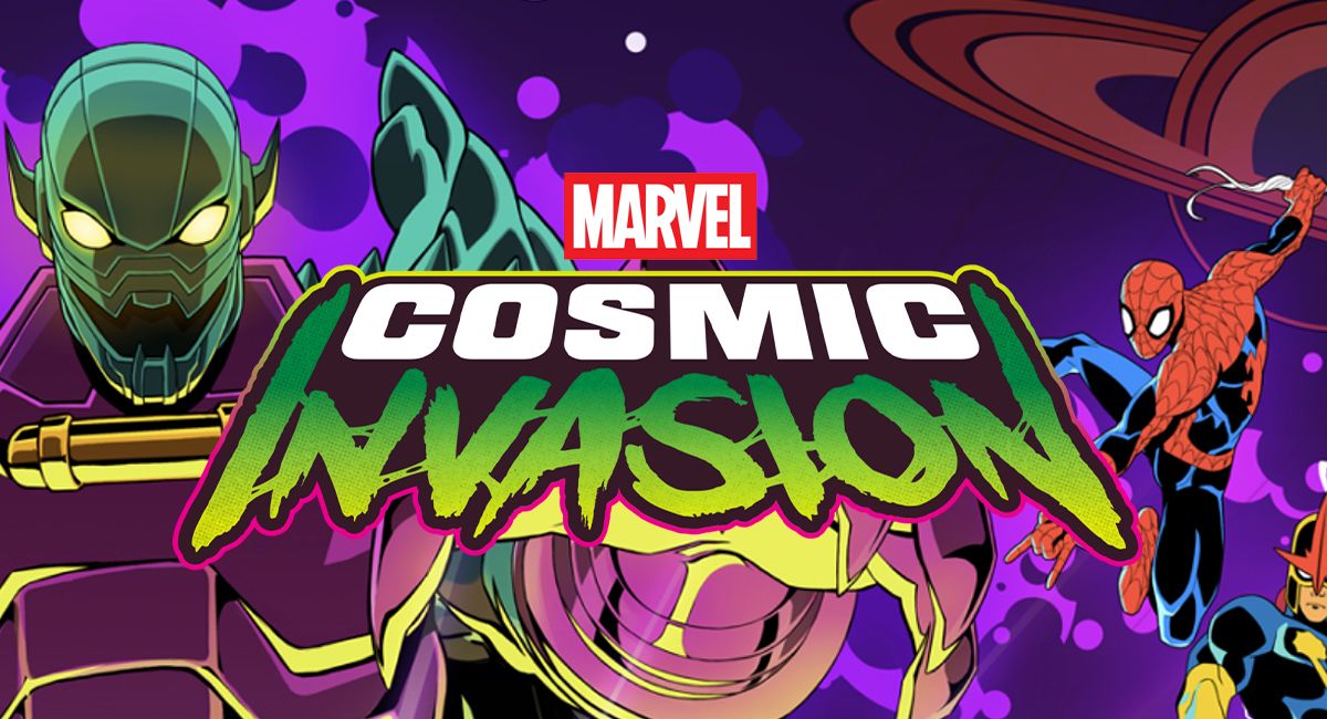
Design Graphic Design Branding Logos & Icons How a designer created the "dirty, organic, insectoid logo" for Marvel Cosmic Invasion News By Joe Foley Published 11 July 2026 A custom font paired with gooey, grimy elements created a design that works on multiple levels. When you purchase through...
Design Graphic Design Branding Logos & Icons How a designer created the "dirty, organic, insectoid logo" for Marvel Cosmic Invasion News By Joe Foley Published 11 July 2026 A custom font paired with gooey, grimy elements created a design that works on multiple levels. When you purchase through links on our site, we may earn an affiliate commission. Here’s how it works. Copy link Facebook X Whatsapp Pinterest Flipboard Email Share this article 0 Join the conversation Follow us Add us as a preferred source on Google Newsletter Subscribe to our newsletter The best gaming logos have to convey an idea of the mood and theme of a game while also creating a strong, recognisable identity that stands out in a crowded market. When it's a major brand like Marvel, the design also has to fit into an existing universe of titles while also showing this release to be distinct.So how does a designer approach the challenge of creating an identity that ticks all of these boxes? Stephane Perez AKA Mardoch has provided a detailed breakdown of how he approached the brief when he designed the Marvel Cosmic Invasion logo for the beat 'em up developed by Tribute Games and published by Dotemu.He created a wide range of assets for the game, from key art to packaging and merchandise, but the logo design marked the start of his involvement and creates a base for the game's identity. Mardoch's Marvel Cosmic Invasion logo design (Image credit: Mardoch / Marvel / Dotemu)"I believe that logos shouldn’t merely complement a brand with a specific style; they need to tell a story and that’s especially true for video game logos," Mardoch says of his philosophy when it comes to logo design."A good gaming logo embodies the game’s spirit by conveying a narrative, referencing specific themes, and projecting a distinct personality. It serves as a promise that the game’s true essence awaits the player." You may like How artists created Star Wars: Maul – Shadow Lord's gritty, painterly aesthetic “Grimy in the right way”: fans divided by new Resident Evil logo Did Apple inspire the new Xbox logo? Mardoch knew from the outset that the Marvel Cosmic Invasion logo needed to evoke several things: space adventure, the Marvel comics universe, and the threat posed by the game’s main antagonist, Annihilus.He quickly defined the three parts. Marvel's existing mark was already given, tying the game to the established Marvel identity, but then there were the two words specific to the game: 'Cosmic' and 'Invasion'.Get the Creative Bloq NewsletterSign up to Creative Bloq's daily newsletter, which brings you the latest news and inspiration from the worlds of art, design and technology.Contact me with news and offers from other Future brandsReceive email from us on behalf of our trusted partners or sponsorsBy submitting your information you agree to the Terms & Conditions and Privacy Policy and are aged 16 or over.Marvel Cosmic Invasion logo design iterations (Image credit: Mardoch / Marvel / Dotemu)"I had several starting directions, but very quickly a texture language took over: something dynamic and futuristic for COSMIC, and something raw and organic for INVASION," Mardoch explains in the breakdown on his website.A few quick exploration passes got him fairly close to the final direction (see the iterations above).Taking inspiration from the fonts used for sci-fi movie titles from the ’60s and ’70s, from Forbidden Planet to Barbarella, he decided the word Cosmic needed bold shapes, slightly rounded corners and a perspective effect for a retro futuristic look. To get just the right shape, he designed a custom font, Marvel Cosmic, which would go on to give the marketing campaign a unique asset. What to read next "A James Bond opening is the one thing that doesn't need to follow trends": how 007 First Light blurred the line between film and gaming How I blend 3D and 3D effects to create video game key art art using Blender and Photoshop Why Xbox’s new logo feels instantly nostalgic As well as serving for the logo, the Marvel Cosmic Font would give the whole marketing campaign a distinct visual asset of its own (Image credit: Mardoch / Marvel / Dotemu)'Invasion' needed to provide a contrast, so Mardoch sought something rougher and more organic. He wanted connecting elements between the letters to create a "sticky, slightly grimy feel" as a reference to Annihilus's insectoid origins. The resulting wordmark has a distinct "gooey" feel that remains in keeping with comic traditions.Once these main concepts were in place, it was a question of making finer adjustments and tweaking the scale and perspective of each element to create the perfect harmony.Mardoch tried a version with a star as a reference to Nova, but found that it made the design too busy and difficult to read at smaller sizes: a game logo still needs to comply with many of the rules of logo design.That said, as this is a game rather than a corporate identity, there's room to add some creative flair. A gradient outline across the whole logo creates a slight glow, intended to echo the saturated colours of space-themed comic books.Mardoch also added a classic halftone print pattern as a texture to push the comic panel feel further. "I built it first in Photoshop, then separated the texture from the letterforms so I could rebuild everything as vector art in Illustrator," he says. "That way the logo could scale cleanly across pretty much any format, from packaging down to a single icon." More design iterations (Image credit: Mardoch / Marvel / Dotemu)"What I like about the final result is that it works on almost every level. It nods to the comics, alludes to the villain, keeps a sci-fi reference, and still reads clearly in black and white and at small sizes," Mardoch says.Work on the logo wasn't quite finished, though. The game logo also needed a motion version, and animated logos involve considerations of their own.Mardoch wanted to maintain the sci-fi mood and decided to animated the two words as separate beats. For 'Cosmic', he was inspired by the trailing echo effect in the opening of the 1980 Flash Gordon movie. For 'Invasion', the inspiration was the title reveal from The Thing. "Reusing it works both as a tribute to the film and as a way to anchor my logo firmly inside a well-defined genre," the designer notes.The finishing touch is a light sheen sweeping across the outline, followed by a small starburst flare going back to that idea of including a nod to Nova‘s star (never abandon an idea completely!)For more inspiration from the Marvel universe, see our interview with Lee Garbett. TOPICS Logo logo design Graphic Design Marvel Joe FoleySocial Links NavigationFreelance journalist and editorJoe is a regular freelance journalist and editor at Creative Bloq. He writes news, features and buying guides and keeps track of the best equipment and software for creatives, from video editing programs to monitors and accessories. A veteran news writer and photographer, he now works as a project manager at the London and Buenos Aires-based design, production and branding agency Hermana Creatives. There he manages a team of designers, photographers and video editors who specialise in producing visual content and design assets for the hospitality sector. He also dances Argentine tango. View More You must confirm your public display name before commenting Please logout and then login again, you will then be prompted to enter your display name. Logout Read more Animation How artists created Star Wars: Maul – Shadow Lord's gritty, painterly aesthetic Gaming “Grimy in the right way”: fans divided by new Resident Evil logo Logos & Icons Did Apple inspire the new Xbox logo? Video Game Design "A James Bond opening is the one thing that doesn't need to follow trends": how 007 First Light blurred the line between film and gaming Digital Art How I blend 3D and 3D effects to create video game key art art using Blender and Photoshop Gaming Why Xbox’s new logo feels instantly nostalgic Latest in Logos & Icons Logos & Icons Taylor Swift used an ingenious design detail to stop her wedding invites leaking Logos & Icons The ultimate advert quiz: think you know your 1940s ads? Logos & Icons Elon Musk’s new SpaceXAI logo looks surprisingly familiar Logos & Icons Taylor Swift's wedding even had its own logo – and she nailed it Logos & Icons Louis Vuitton wins logo battle despite fiery backlash Logos & Icons The world's oldest football club just modernised its logo design, and fans are furious Latest in News 3D Printing As a photographer, the new Insta360 X Bambu Lab collab makes me incredibly happy Poster Design This fan-made movie poster trend proves cinema is in a creative funk Video Game Design This hand-drawn game looks like a surreal graphic novel come alive UX & UI This free app is like Tinder for video games Branding Pepsi apologised for its Wild Cherry controversy, but it should have known better Advertising The Economist shades AI in sharp new billboard ads LATEST ARTICLES1Spontaneous speed painting could help you to trust your art2This hand-drawn game looks like a surreal graphic novel come alive3This fan-made movie poster trend proves cinema is in a creative funk4As a photographer, the new Insta360 X Bambu Lab collab makes me incredibly happy5These headphones are inspired by a pair of crappy 1980s budget speakers... but they sound excellentSource: Creative Bloq AI Art — Published — Category: Image AI