Maryland University tangled in unlikely logo dispute
(Image credit: Getty Images) Copy link Facebook X Whatsapp Pinterest Flipboard Email Share this article 0 Join the conversation Follow us Add us as a preferred source on Google Newsletter Subscribe to our newsletter Maryland University is in a design dispute with a cannabis dispensary over an…
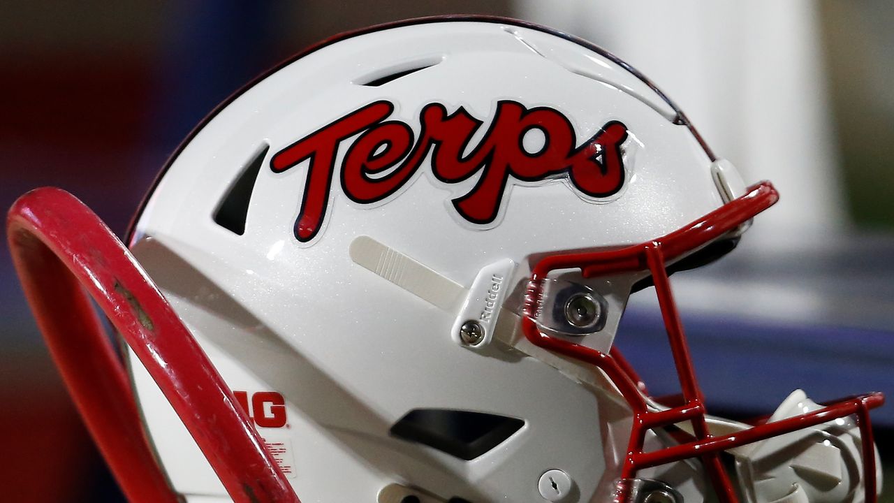
(Image credit: Getty Images) Copy link Facebook X Whatsapp Pinterest Flipboard Email Share this article 0 Join the conversation Follow us Add us as a preferred source on Google Newsletter Subscribe to our newsletter Maryland University is in a design dispute with a cannabis dispensary over an allegedly similar logo. Appearing across the university's merchandise and branding, the 'Terps' (short for terrapins) logo has been a heritage asset for the institution, and it's not afraid to protect it.While the design world is no stranger to logo disputes, Maryland University's fierce cease-and-desist strategy proves just how important heritage design can be. With the dispensary not willing to part with its identity, it seems we're entering the ultimate battle of the script fonts. (Image credit: Maryland University/Terps USA)While the university has historically used the term 'Terps' as shorthand for its sports teams, the Maryland Terrapins, the word has taken on a very different meaning in the cannabis industry. The rival Terps USA brand name comes from terpenes used to modify and enhance cannabis products, and while the name clash seems like a coincidence, Maryland University isn't pleased with the branding.Latest Videos FromCreative BloqWatch full video here: Both the Terps and Terps USA branding feature a cursive font in bold red, with allegedly similar flourishes on the 'r' and 's' letterforms. In an email to Terps USA owner Ken Fry, the University claimed, "Your company has stolen the name and trademarked image from the University of Maryland," with the cease-and-desist letter soon to follow. "Such an association would materially impair the goodwill embodied in the University’s famous TERPS marks,” it claimed. (Image credit: Terps USA)Ken has since adjusted the logo, keeping the cursive font with the addition of a gold drop shadow embellishment. The red has been swapped for a more fitting green theme, but the owner is keen to maintain the name, claiming, "It’s ours. You’re not taking our name because you don’t like it." Ken went on to tell Fox 5 DC, "Will we sit down and talk to you about the logo and have a conversation and work it out? Absolutely. We’d be more than happy to do that. But we’re not giving up our name." For more design disputes, check out the Patagonia logo lawsuit controversy that is every brand's worst nightmare, or take a look at when Aston Martin picked a logo battle with its own shareholder.Get the Creative Bloq NewsletterSign up to Creative Bloq's daily newsletter, which brings you the latest news and inspiration from the worlds of art, design and technology. TOPICS Natalie Fear Staff Writer Natalie Fear is Creative Bloq's staff writer. With an eye for trending topics and a passion for internet culture, she brings you the latest in art and design news. Natalie also runs Creative Bloq’s 5 Questions series, spotlighting diverse talent across the creative industries. Outside of work, she loves all things literature and music (although she’s partial to a spot of TikTok brain rot). View More You must confirm your public display name before commenting Please logout and then login again, you will then be prompted to enter your display name. Logout LATEST ARTICLES 1 Save up to 52% on creative tech from Creality this Labor Day 2 How two tweets cost Elon Musk the Twitter logo 3 Clever and comfortable, the Bose QC Ultra 2 offers custom tuning and has $70 off for Labor Day 4 The vibrant markers perfect for everyone from pro artists to children are reduced by up to 26% for Labor Day 5 Huion's new Kamvas Pad 12 could fix the biggest problem with Android tablets for artSource: Creative Bloq AI Art — Published — Category: Image AI