McLaren’s new logo looks like a luxury fashion brand
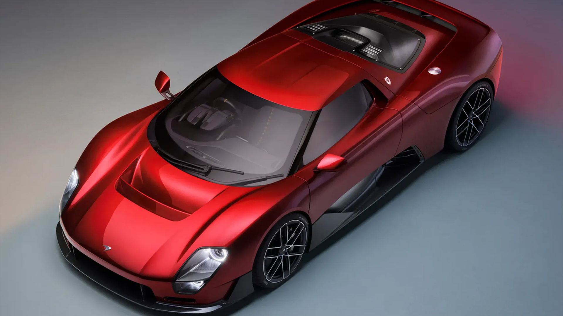
(Image credit: McLaren) Copy link Facebook X Whatsapp Pinterest Flipboard Email Share this article 0 Join the conversation Follow us Add us as a preferred source on Google Newsletter Subscribe to our newsletter Luxury car brand McLaren has unveiled a slick new brand identity, evolving its iconic…
(Image credit: McLaren) Copy link Facebook X Whatsapp Pinterest Flipboard Email Share this article 0 Join the conversation Follow us Add us as a preferred source on Google Newsletter Subscribe to our newsletter Luxury car brand McLaren has unveiled a slick new brand identity, evolving its iconic heritage look for the next generation. At the centre of the new look is a fresh wordmark, inspired by the brand's humble origins, marrying classic design with a future-forward spirit.With rival brands like Jaguar proving that a miscalculated logo can cost you public favour, it's never been a more nerve-wracking time for brands to evolve. But with a careful blend of heritage and modern refinement, it seems McLaren has nailed the contemporary car logo.This is McLaren.Created for what comes next.We are proud to reveal our evolved brand identity, one that expresses the ambition, creativity and confidence that is shaping McLaren’s future. 🧡Our roots remain firmly planted in our legendary history. We’re moving forward with… pic.twitter.com/rlR4mK9aykSeptember 22, 2026McLaren's new logo features a clean wordmark in a modern sans-serif. Inspired by the sign above the McLaren family service station in Remuera, Auckland, dating back to the 1920s, the design ties in the brand's rich history while giving the brand a slicker, modern appeal thanks to its lighter weight.Latest Videos FromCreative BloqWatch full video here: (Image credit: McLaren)A subtle underscore beneath the lowercase 'c' brings a further polish to the design, giving it a luxury feel in line with some of the best fashion logos. The old logo's iconic speedmark is reintroduced for the brand's golf and racing subbrands, reflecting "the value of continuity and its enduring significance to fans around the world." (Image credit: McLaren)"It's a reflection of the journey we are on as a company," explains David Woodhouse, chief creative officer at McLaren Automotive. "It marks the beginning of a new chapter for McLaren, giving a physical expression to the ambition, creativity and forward momentum that is shaping our future.""It celebrates the symbols and stories our fans, partners and team mates already know and love, while giving us a more connected expression of where we’re heading next. It feels unmistakeably McLaren," adds Lou McEwen, chief marketing officer at McLaren Racing. (Image credit: McLaren)As with all new brand identities, I suspect that McLaren's new look will certainly ruffle some feathers. The chunky, retrofuturistic look of the old design was iconic but slightly dated, and while it served a purpose, the new look feels far more in tune with McLaren's past and future.Get the Creative Bloq NewsletterSign up to Creative Bloq's daily newsletter, which brings you the latest news and inspiration from the worlds of art, design and technology. For more car design, take a look at why the Ferrari Luce is so controversial or check out Tesla's mysterious new logo design that sparked some surprising theories. TOPICS Natalie Fear Staff Writer Natalie Fear is Creative Bloq's staff writer. With an eye for trending topics and a passion for internet culture, she brings you the latest in art and design news. Natalie also runs Creative Bloq’s 5 Questions series, spotlighting diverse talent across the creative industries. Outside of work, she loves all things literature and music (although she’s partial to a spot of TikTok brain rot). View More You must confirm your public display name before commenting Please logout and then login again, you will then be prompted to enter your display name. Logout LATEST ARTICLES 1 This out-there branding is the bravest design I've seen all year 2 This weird Walmart banana hack could save you $20 on Nintendo Switch games like Fire Emblem: Fortune’s Weave, apparently 3 I finally learned to enjoy 3D art with this workflow using 3DCoat, Quixel Mixer, Blender and Photoshop 4 One of Disney's biggest flops has been reimagined as a beautiful hand-drawn 2D animation, and some fans think it's a big improvement 5 The Tesla Cybercab has a pretty silly design failSource: Creative Bloq AI Art — Published — Category: Image AI