People can't decide whether Newcastle United's logo design poll is a joke
Copy link Facebook X Whatsapp Pinterest Flipboard Email Share this article 0 Join the conversation Follow us Add us as a preferred source on Google Newsletter Subscribe to our newsletter Sports logo redesigns can be contentious, as teams as varied as Unione Sportiva Livorno 1915 and Manly Warringah…
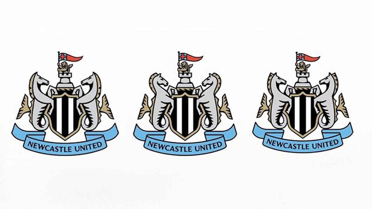
Copy link Facebook X Whatsapp Pinterest Flipboard Email Share this article 0 Join the conversation Follow us Add us as a preferred source on Google Newsletter Subscribe to our newsletter Sports logo redesigns can be contentious, as teams as varied as Unione Sportiva Livorno 1915 and Manly Warringah Sea Eagles have discovered. Putting an identity through a democratic process can be a way to give fans a sense of ownership of the design, but that works when there are options.Three designs for the new Newcastle United logo have been put to a vote among supports, but some fans are asking if the poll is a joke. They're struggling to tell the three options apart. Manely the same: the three options for the new Newcastle United logo (Image credit: Newcastle United) The current Newcastle United logo has been in use since the 1980s (Image credit: Newcastle United)The Newcastle United badge is often considered one of the best UK football logos. That makes some fans wonder why the club would want to change it, but the club says the badge, which was designed in the late Eighties, "struggles to perform in a modern setting" due to its "intricacies and irregularities" that "make consistent, high-quality reproduction impossible".Latest Videos FromCreative BloqWatch full video here: The shortlisted three options all follow the same concept as the existing design, based on the Newcastle's historic coat of arms. There's the central black-and-white striped shield and a Norman keep bearing a lion holding St George's cross. Two supporting seahorses represent the city's maritime history while a blue banner carries the club's name.There are differences are in the shape of the seahorses heads and manes, but they're subtle details would come towards the end of the design process once the general direction is already defined. That appears to be not the kind of aspect fans are most bothered about. For some, the club's trying to create an illusion of choice when it's already chosen the design."You may as well ask if you like the one with black and white stripes or the one with white and black stripes," one person writes on Facebook. "Is this a wind up? We're being asked to choose the shape of the seahorses' manes?" another supporter asked.I can see why Newcastle sees the need for a redesign. The current logo is very complex. The problem is that many attempts to simplify designs are seen by fans as looking cheaper. The trio of prospective badges have been dubbed "Poundland downgrades" and "AI-looking knockoffs".Get the Creative Bloq NewsletterSign up to Creative Bloq's daily newsletter, which brings you the latest news and inspiration from the worlds of art, design and technology.Some suggesting that if the design had to be made simpler, the club's magpie badge from the late '70s and early '80s would be a good contender inspired by the team's nickname."I thought they would have had the castle, river and magpie crest. Easier to see and identify with," one person writes. "Either come up with something entirely different or leave it as is, don’t just downgrade what we already have," another fan pleads.Posted by NewcastleWorldNUFC on Newcastle United says it hosted dedicated supporter events and focus groups and "sense-checked the challenge and potential routes forward" with its Fan Advisory Board in order to choose the shortlisted designs. It says 84% of respondents favoured updating the existing crest rather than exploring a completely new design concept.On the club's website, it says: "In an increasingly competitive global landscape, it constrains our ability to represent this club to the standards it truly deserves. But it’s not just a question of competing commercially, it’s also one of pride."This is not change pursued for the sake of it. Evolution is essential, ensuring our crest remains authoritative, legible, and unmistakably Newcastle. Not just for supporters today, but for every generation that follows."It's also keen to point out that it hasn't followed the "generic circular badge" route adopted by some other clubs. TOPICS Joe FoleyFreelance journalist and editorJoe is a regular freelance journalist and editor at Creative Bloq. He writes news, features and buying guides and keeps track of the best equipment and software for creatives, from video editing programs to monitors and accessories. A veteran news writer and photographer, he now works as a project manager at the London and Buenos Aires-based design, production and branding agency Hermana Creatives. There he manages a team of designers, photographers and video editors who specialise in producing visual content and design assets for the hospitality sector. He also dances Argentine tango. View More You must confirm your public display name before commenting Please logout and then login again, you will then be prompted to enter your display name. Logout LATEST ARTICLES 1 See how this 3D artist experiments with colour in renders 2 Taylor Swift's Trump TikTok takedowns show the White House isn't above copyright law 3 Buc-ee's infamous logo design lawsuits are coming back to bite it 4 The Apple Watch redesign can't come soon enough 5 What are blend shapes in 3D animation, and how do you use them?Source: Creative Bloq AI Art — Published — Category: Image AI