Vermont's logo looks like it was made in five seconds... so why do I love it?
(Image credit: Vermont Tourism / DNCO) Copy link Facebook X Whatsapp Pinterest Flipboard Email Share this article 0 Join the conversation Follow us Add us as a preferred source on Google Newsletter Subscribe to our newsletter My first reaction to Vermont's new tourism wordmark by DNCO was…
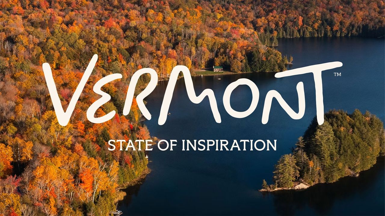
(Image credit: Vermont Tourism / DNCO) Copy link Facebook X Whatsapp Pinterest Flipboard Email Share this article 0 Join the conversation Follow us Add us as a preferred source on Google Newsletter Subscribe to our newsletter My first reaction to Vermont's new tourism wordmark by DNCO was suspicion. Initially, this loose, looping scrawl looked like something I could have knocked out on a napkin while waiting for my coffee. Not the output of a nine-month process involving a global place branding agency. Admittedly – as fellow Creative Bloq writer Joe Foley pointed out in his news story – on closer inspection, the letterforms carry real intent. A winding road in the 'e', mountain peaks in the 'm', a moon over the hills in the 'o'. Yet even once I'd clocked all that, I still couldn't shake the feeling that it all looked like it had been dashed off in the time it takes to sip of coffee.However, over the last few days, I've kept coming back to it. And I've grown to, at first, like it and now absolutely love it. Why the turnaround? Well I think it's made me reflect on what tourism branding is supposed to do to us. Latest Videos FromCreative BloqWatch full video here: Most state and city logos aim for polish: crisp vector shapes, confident symmetry, the visual equivalent of a firm handshake. Vermont's does the opposite. It wobbles. The baseline dips and rises like it's been drawn by someone leaning on a fence post. And once I'd looked at it a few times, that started to work its magic on me.There's a reason hand-lettered signage works on roadside farm stands. It signals that a human being made this, because they had something to sell you, and no time to overthink it. Vermont's logo borrows that shorthand wholesale. It's not trying to look considered. It's trying to look like it came from someone who cares more about the maple syrup than the kerning. (Image credit: Vermont Tourism / DNCO)That's a difficult thing to fake convincingly, of course, and it's worth considering how easily this kind of thing goes wrong. Plenty of brands have reached for "handmade" and landed on "template with a wobble filter applied"; the marketing equivalent of distressed jeans that haven't actually ever been worn.Vermont's mark avoids that trap mostly because the wobble isn't decorative; it's structural. The road is a real road, the peaks are real peaks, the moon is a real moon rising over Camel's Hump on any given autumn evening.Get the Creative Bloq NewsletterSign up to Creative Bloq's daily newsletter, which brings you the latest news and inspiration from the worlds of art, design and technology.Take away the meaning and the whole thing would collapse into gimmick. With it, though, the roughness reads as evidence, not affectation.Nine months of keeping your nerveWhat I admire most is the nerve. Somewhere in that nine-month process, someone had the authority to say: leave the line uneven, don't square off the loop of the 'V', let the 'o' sit slightly off true. Every one of those decisions is a small act of resistance against the instinct that makes most brand guidelines end up looking boringly safe. (Image credit: Vermont Tourism / DNCO)Tourism boards don't often take that kind of risk, and for good reason. They answer to residents, to legislators, to an economy worth billions, and the safest move is almost always to smooth things out. Vermont's commissioning team could simply have asked for a cleaner version. But if they had, the brand would have lost the one thing that makes it recognisable at 100 paces on a crowded page of state tourism logos.So yes, Vermont's new logo might look like it took five seconds to make. But what's more important to me are the five seconds' worth of confidence that led the designers to make a leap into the unknown, untested and visually interesting. And as a piece of obvious nerve, dressed up as nonchalance, this logo is very hard not to like. TOPICS Tom MayFreelance journalist and editorTom May is an award-winning journalist specialising in art, design, photography and technology. He is the author of the books The 50 Greatest Designers (Arcturus) and Great TED Talks: Creativity (Pavilion). Tom was previously editor of Professional Photography magazine, associate editor at Creative Bloq, and deputy editor at net magazine. View More You must confirm your public display name before commenting Please logout and then login again, you will then be prompted to enter your display name. Logout LATEST ARTICLES 1 Vermont's logo looks like it was made in five seconds... so why do I love it? 2 High-end audio take note: These $35 earphones have 2 sound profiles and they're both great 3 Ricky Gervais’ Alley Cats proves animation is the perfect home for weird ideas 4 Nothing’s Clip Pro earbuds made me paranoid – so I put them to the test 5 Japan asks Trump to quit it with the weird Super Mario videos alreadySource: Creative Bloq AI Art — Published — Category: Image AI