I hate to say it, but the backlash to this beer company's rebrand is justified
(Image credit: Timothy Taylor's) Copy link Facebook X Whatsapp Pinterest Flipboard Email Share this article 0 Join the conversation Follow us Add us as a preferred source on Google Newsletter Subscribe to our newsletter Over the last few years, it's started to feel like there's no such thing as a…
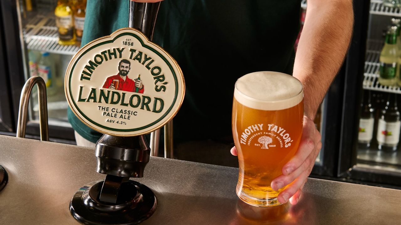
(Image credit: Timothy Taylor's) Copy link Facebook X Whatsapp Pinterest Flipboard Email Share this article 0 Join the conversation Follow us Add us as a preferred source on Google Newsletter Subscribe to our newsletter Over the last few years, it's started to feel like there's no such thing as a rebrand without a backlash. From Jaguar to Cracker Barrel, several brands have had to fight fire after launching contemporary new looks – particularly when their efforts have been perceived, whisper it, woke.I've become pretty sceptical of these backlashes recently. It's hardly a secret that the internet feeds of controversy, and in most cases, people aren't reacting to the actual design logic behind a rebrand. But when it comes to British beer brand Timothy Taylor's new look, I'm sad to say I agree with the outcry. The evolution of Timothy Taylor's branding (Image credit: Timothy Taylor's)The Yorkshire brewery has unveiled its first major rebrand in more than a decade, with a new logo, new packaging, new pump clips and, most notably, a new man on the front of its signature beer, Landlord.Latest Videos FromCreative BloqWatch full video here: The brand is allegedly trying to appeal to Gen Z drinkers, who are developing a taste for cask ale. CEO Andrew Carter says the refresh is not about changing what the brewery makes, but about ensuring “the quality and care that go into every pint are reflected in how Timothy Taylor’s is presented today”. The brewery wants to remain “just as relevant to the next generation of drinkers as we’ve been to the last”.But I can't help but look at the new Landlord character and think, why does he look like that? Why is he suddenly younger, fitter and more handsome? Why has he got a head (and chin) full of hair? The old bloke looked like a character, like your stereotypical idea of a pub landlord. This one looks like an actor you'd cast as the head of a fledgling microbrewery. Brands have been rediscovering the importance of heritage design in recent years (Image credit: Burger King/Pepsi)I've no problem with a brand choosing to modernise its image, particularly when that brand is on the up. Timothy Taylor's Landlord is the UK’s best-selling cask ale by both value and volume. But I fear the brand has mistaken old-fashioned for unfashionable. Brand heritage is more important than ever in today's world of fleeting design fads and, yes, artificial content. The cultural currency of history is clear, with countless brands resurrecting old logos over the last few years.It's the little peculiarities, unfashionable colours, old fashioned text and, yes, old-fashioned characters, that prevent brands slipping into homogeny in today's world of flat design and sans serif text. Timothy Taylor's had something that a lot of contemporary brands would pay agencies a lot of money for: genuine character.Get the Creative Bloq NewsletterSign up to Creative Bloq's daily newsletter, which brings you the latest news and inspiration from the worlds of art, design and technology.I don't think this one ranks up there with Jaguar when it comes to branding misfires. And I don't think there's much ideology behind it – we don't need a bunch of thought pieces about "woke beer", or even responses, like The Spectator's calling the rebrand "a disgrace". It's just a UK beer brand updating its packaging. We'll all survive, and the beer will still taste the same.But I do think there's a useful lesson here for brands and designers. Modernising a heritage brand doesn't have to mean making it look modern. After all, Timothy Taylor's is riding high, and already hugely popular among younger drinkers. The old landlord was clearly doing something right. TOPICS Daniel John Design Editor Daniel John is Design Editor at Creative Bloq. He reports on the worlds of design, branding and lifestyle tech, and has covered several industry events including Milan Design Week, OFFF Barcelona and Adobe Max in Los Angeles. He has interviewed leaders and designers at brands including Apple, Microsoft and Adobe. Daniel's debut book of short stories and poems was published in 2018, and his comedy newsletter is a Substack Bestseller. View More You must confirm your public display name before commenting Please logout and then login again, you will then be prompted to enter your display name. Logout LATEST ARTICLES 1 Elon Musk's daughter's Tesla-trolling fashion advert is as cinematic as Star Wars 2 This logo just turned 40, but it could have been made yesterday 3 Geekom IT13 Max review: Max by name, but restricted by nature 4 iPhone Duo is coming, but these rival tried-and-tested foldable phones have up to $500 off 5 Ad platform sparks brand romance with 100 love letter billboardsSource: Creative Bloq AI Art — Published — Category: Image AI