Loewe’s lowkey logo sandals divide fashionistas
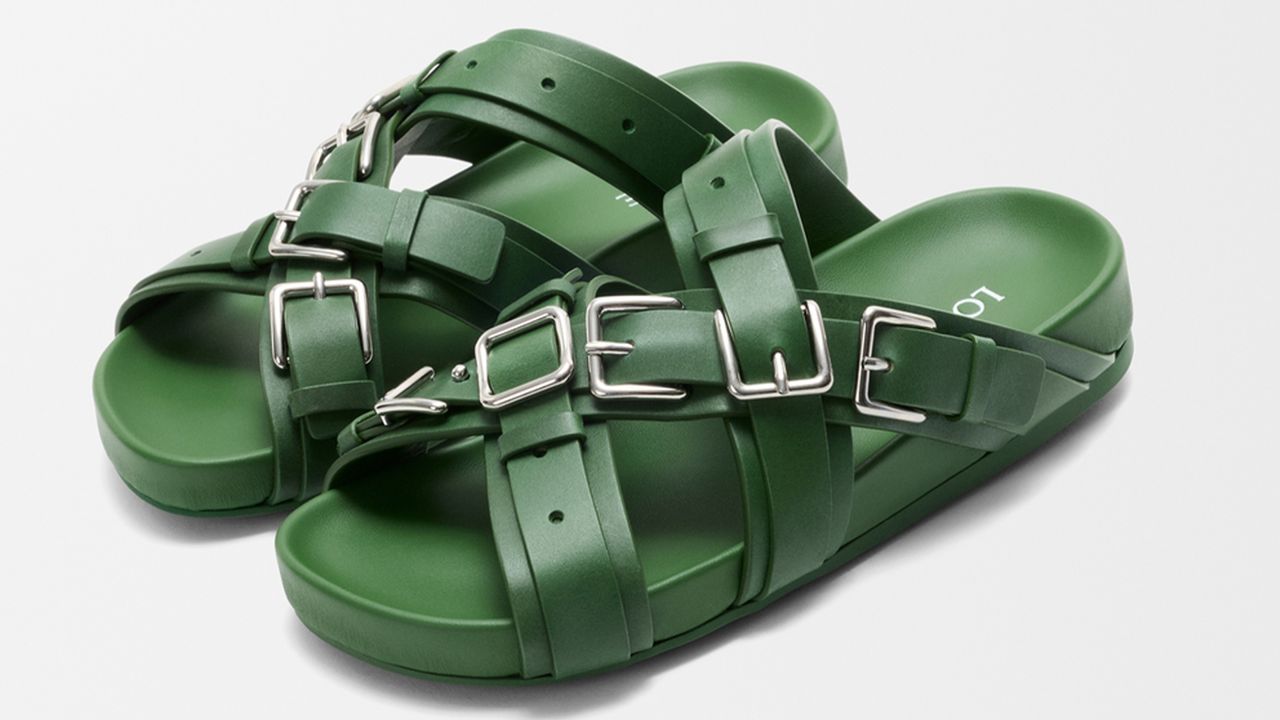
(Image credit: Loewe) Copy link Facebook X Whatsapp Pinterest Flipboard Email Share this article 0 Join the conversation Follow us Add us as a preferred source on Google Newsletter Subscribe to our newsletter During the mid 2010s, social media was awash with flex culture, fast cars and flashy brand…
(Image credit: Loewe) Copy link Facebook X Whatsapp Pinterest Flipboard Email Share this article 0 Join the conversation Follow us Add us as a preferred source on Google Newsletter Subscribe to our newsletter During the mid 2010s, social media was awash with flex culture, fast cars and flashy brand logos, defining the new money influencer age. Thankfully, these days loud luxury logo branding has seemingly been laid to rest, but that means brands have been forced to get a little more creative with how they display their logo design, lest we return to the dark days of Gucci monogram tracksuits.One brand nailing the brief is luxury Spanish fashion house Loewe, with its subtly genius new logo sandals. Before I give too much away, take a look for yourself and see if you can spot the logo – I promise once you see it, you won't be able to unsee it. (Image credit: Loewe)The crafty design features on Loewe's new Type Fussbett sandal, which evolved from the simple design of an everyday buckle. What has historically been an object of function is transformed into a feature accessory, forming the Loewe name across the shoe. It's a subtle yet clever flourish that proves how quiet luxury has usurped loud branding and garish logos.Latest Videos FromCreative BloqWatch full video here: Despite the clever design, the sandals seemed to divide fans, with one writing, "I would buy them simply for the creativity in that hardware," while another undecided commenter wrote, "they’re ugly, but the concept is so gaggy that I rounded back to loving them." Another shared a similar sentiment, writing, "Kinda ugly, kinda chic, kinda quirky. Love it," while one fan commented, "Whoever thought of this one needed a cute lil bonus on that check." For more logo design inspiration, check out how this counter-fashion brand logo cleverly uses negative space or take a look at the best fashion logos. Get the Creative Bloq NewsletterSign up to Creative Bloq's daily newsletter, which brings you the latest news and inspiration from the worlds of art, design and technology. TOPICS Natalie Fear Staff Writer Natalie Fear is Creative Bloq's staff writer. With an eye for trending topics and a passion for internet culture, she brings you the latest in art and design news. Natalie also runs Creative Bloq’s 5 Questions series, spotlighting diverse talent across the creative industries. Outside of work, she loves all things literature and music (although she’s partial to a spot of TikTok brain rot). View More You must confirm your public display name before commenting Please logout and then login again, you will then be prompted to enter your display name. Logout LATEST ARTICLES 1 The Nintendo Switch 2 Zelda 40th anniversary edition looks like a precious relic from Hyrule 2 This typography artist is giving away 200 free fonts, but you need to be quick 3 These are the best AI laptops for motion design and VFX 4 This is what Nintendo's Zelda: Ocarina of Time remake actually looks like on Switch 2 5 This free app could become the Blender of texture painting softwareSource: Creative Bloq AI Art — Published — Category: Image AI