The easy way to make epic fantasy art using Blender and Photoshop
Copy link Facebook X Whatsapp Pinterest Flipboard Email Share this article 0 Join the conversation Follow us Add us as a preferred source on Google Newsletter Subscribe to our newsletter This is a part of our series of features on the basics of 3D art and animation. Also see our pieces on 3D art…
Annons
Annons
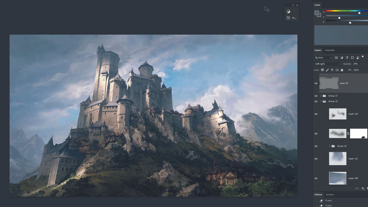
Copy link Facebook X Whatsapp Pinterest Flipboard Email Share this article 0 Join the conversation Follow us Add us as a preferred source on Google Newsletter Subscribe to our newsletter This is a part of our series of features on the basics of 3D art and animation. Also see our pieces on 3D art workflows, how to smooth or harden 3D models and what a 3D object is made of. If you need the tools to get started, see our guides to the best 3D modelling software and the best laptops for 3D modelling.In this workshop, I’ll show you some Blender tricks that you can use while building your illustration scenes. No plugins, no paid 3D models; just basic free Blender and basic knowledge of modelling using extrude and bevels. Of course, feel free to use anything that you can – using models from places like Megascans greatly helps with the quality of render. But if you can create a scene using nothing but the software itself then you will be able to create them using any additional resources out there. Afterwards, I’ll jump into Photoshop and do basic photobashing with overpainting using mostly a mixer brush. This part is all about getting rid of that 3D feel we get while rendering and fixing any visible mistakes. For the purpose of this workshop, I’ll stick to the idea of creating a castle in a fantasy setting because I don’t want to overcomplicate this by focusing too much on the design aspect of image creation. If you encounter any trouble with designing, stay as close to your reference as possible. You can even recreate it one-to-one – after all the goal here is to learn the technique 01. Preparation – creating basic form To fight the fear of blank page, I like to start with making building blocks of my scene right away. I take my reference image – in this case, it’s an image of a castle from Wikipedia – and try to recreate it with the simplest shapes; almost like wooden toy blocks so I can easily understand the shape and form language. 02. Creating a collection of assets I lay out all of the elements separately and group them by big, medium and small sizes. I’m also adding assets for the terrain and additional small houses – everything I can see on the reference in a simplified form. Focus on capturing the right scale by comparing elements with each other; a window on a house should be the same scale as the one on a tower. 03. Preparing the textures Next in Photoshop, I prepare a kind of collage or a trim sheet of the textures I want to use for specific group of assets, like walls and roofs for castle pieces. I’m using photobashing, stretching, blending in and overpainting. I can also use filters like Dust & Scratches to alter images so that they have a more painterly look. Additionally, on plain walls, I paint in the windows, ledges and columns 04. Setting up the textures Drag and drop the texture into Shader Editor to get the orange node and connect it to Base Color in Principled BDSF node. The only other change I’m making is to set Roughness to 1. In the UV Editor, you can see the texture where we lay out faces of the models. Remember to reset the scale of the model and project UVs if they are stretched 05. Advanced modelling using textures I can use the textures as guidelines for modelling details. The tower and house on the left are still in their most basic form. While on the right side, you can see the version where I extruded the details I could see on the texture. Feel free to add more details like chimneys, wooden planks, balconies, etc. 06. Assembling the collection I used the same principle for the terrain and rocks. First, I photobashed and overpainted the texture, applied it to a plane and sculpted a rough representation of trees by tapping the brush on a subdivided surface. It’s a good idea to add a ‘Decimate’ modifier to those models to reduce the amount of polygons. I want those models to be simple in structure as well so my PC doesn’t blow up. 07. Setting up the final scene I now open a new Blender file that will serve as the final scene setup. I divide it like this: big window for assembling everything together; bottom left for textures; bottom right for the camera view that I keep on Viewport Shading showing me the final result. I keep it small so I can see the composition without any distractions. 08. Playing with the blocks At this point, I’m copying my assets from the established collection and just playing with them. Then I play with the direction of the sun and camera until I’m happy with the result. This way, you can easily set up multiple blockouts, lighting scenarios and cameras. If you’re struggling, try recreating a scene from your reference and then break it afterwards for unique results. 09. Additional atmosphere assets These are some additional pieces that you might need in almost any 3D scene. The first one is the clouds generated with basic Noise Texture – I can control its scale and Colour Ramp settings to cast shadows in my scene. Second is simple fog using a Principled Volume node. The last one is a photo I took of clouds on a plane connected to Emission in texture settings 10. Putting everything together I use all of those assets to enhance the composition. I’m also using Area Lights to enhance the highlights in places I believe deserve to be in the spotlight and draw the viewer’s eye. These simple planes with a subtle mix of Emission and Transparency are good to make the division between foreground, midground and background even stronger. All of these techniques mimic some stages of overpainting in Photoshop 11. Compositor in Blender I almost always use Compositor in Blender. It lets me alter the render’s final result by colour correcting, adding realistic lens effects and many others. Here, I found a node that lets me add warm colour to the highlights. I’ve also enhanced the exposure and added a subtle vignette effect. Remember to change ‘Disabled’ to ‘Always’ in the Viewport Shading options window. 12. Photoshop setup I always open a second window and scale it down in order to see the whole picture. Other than that, I just have my Colour and Layers tabs, and History on the side, plus an additional window where I can quickly add and control Adjustment Layers. At this point, it’s a good idea to zoom in and see if there’s a need to go back for rearranging and re-rendering. 13. Photobashing and overpainting Photobashing and overpainting Here is my photo of rocks and countryside laid out on top of the render. I used three Adjustment Layers connected to make a seamless transition. Levels to control the value. Colour Balance and Hue/Saturation are responsible for matching the photo with the underlying image. A mixer brush and eraser is used to blend in the edges of the photograph. I repeat processes like that over the illustration 13. Finishing the illustration I use plenty of different techniques to reach the goal of enhancing the composition and the read of the illustration. A good rule of thumb is this: when you look around your image and find brushstrokes, parts of a photo or render that you cannot understand, ask yourself a question: is this part important for the image? If the answer is yes then you should work around it until you know what you’re looking at. 13. Photoshop setup Photobashing and overpainting Here is my photo of rocks and countryside laid out on top of the render. I used three Adjustment Layers connected to make a seamless transition. Levels to control the value. Colour Balance and Hue/Saturation are responsible for matching the photo with the underlying image. A mixer brush and eraser is used to blend in the edges of the photograph. I repeat processes like that over the illustration This article originally appeared in ImagineFX. Subscribe to ImagineFX to never miss an issue. Print and digital subscriptions are available.Creative Bloq is now easier to access than ever before with our on-the-go app, which brings you all the content you know and love from our website, but in a super-streamlined design.Download the Creative Bloq app for iOSDownload the Creative Bloq app for AndroidGet the Creative Bloq NewsletterSign up to Creative Bloq's daily newsletter, which brings you the latest news and inspiration from the worlds of art, design and technology. Patryk StefaniakPatryk is a concept artist possessing 10 years of experience in video games and VFX/film. View More You must confirm your public display name before commenting Please logout and then login again, you will then be prompted to enter your display name. Logout LATEST ARTICLES 1 This beautiful fountain pen is 40% off right now 2 Build your own t-shirt printing empire with £1,130 off this starter kit 3 Has Apple dropped the ball with its Gen Z marketing? 4 My favourite iPhone accessories I've tested this year – cases, power banks, ring holders and stands 5 The story of China's viral "worst animation ever" just keeps getting weirder