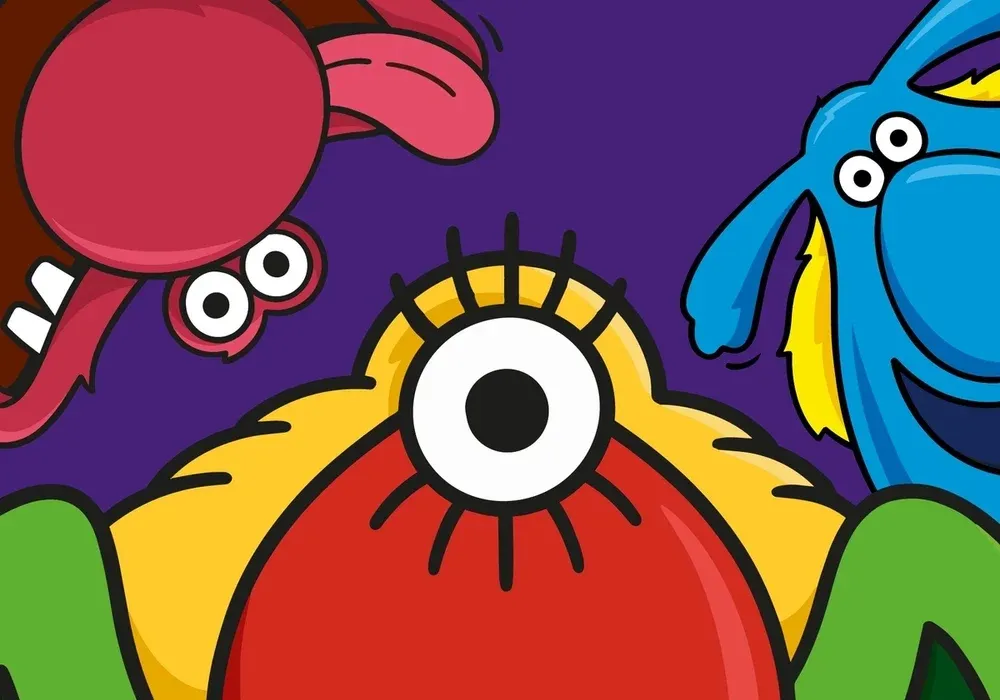
The Monster Munch rebrand shows a great brand mascot can last a lifetime
Copy link Facebook X Whatsapp Pinterest Flipboard Email Share this article 0 Join the conversation Follow us Add us as a preferred source on Google Newsletter Subscribe to our newsletter From Apple's Little Finder guy to Crocs' Niles the croc, mascots are as big as ever in branding in 2026. Sony's…
Annons
Annons
Copy link Facebook X Whatsapp Pinterest Flipboard Email Share this article 0 Join the conversation Follow us Add us as a preferred source on Google Newsletter Subscribe to our newsletter From Apple's Little Finder guy to Crocs' Niles the croc, mascots are as big as ever in branding in 2026. Sony's even decided it needs a character to rival Hello Kitty.Some brands have seen fit to update long-standing character designs for modern times. We've seen Kellogg's turn the Corn Flakes rooster into a kaiju and Kraft Heinz torture its Jet-Puffed marshmallows. But a classic British corn crisps brand has just proved that a great character design can stand the test of time with very little tinkering. The new look Monster Munch Image credit: PepsiCo Image credit: PepsiCo When I was a lad, pickled onion Monster Munch was the king of crisps, but this was in the days before we had such exotic flavours as black truffle and Thai sweet chilli on supermarket shelves.Latest Videos FromCreative BloqWatch full video here: It's an impressive sign of endurance to that Monster Munch not only still has a place in the market, but that it's using the same cast of monster characters as when Smiths launched the brand four decades ago. The monster's evolution: previous iterations of the Monster Munch packaging design and character (Image credit: PepsiCo / Future) The new look for picked onion (Image credit: PepsiCo)Owned by PepsiCo since 1989, Monster Munch has undergone several refreshes over the years. It's always tried to avoid scaring away loyal fans, with the monsters remaining a constant, but other details had started to steal focus away from them.The refresh turns back the clock in a sense, making the the monsters the stars again and their heritage value plain to see. The work of PepsiCo’s own European design team, it includes a tweaked logo, together with a new monogram, and updated illustrations, packaging design and photography.Redrawn versions of the trio of monsters take things back to basics, tossing out the computer-generated 3D look and gradient backgrounds of recent years in favour of a simpler, bolder aesthetic that highlights the brand's nostalgic appeal, keeping things playful while refining well-recognised elements.Get the Creative Bloq NewsletterSign up to Creative Bloq's daily newsletter, which brings you the latest news and inspiration from the worlds of art, design and technology.Writing on LinkedIn , Jon Bailey, senior design manager at PepsiCo, says the brand's long history required a cautious approach.The light touch makes good sense. The monster characters have been around since the brand's launch in 1977, initially as The Prime Monster. They've endured because they're so distinct and recognisable. There's a little bit of The Muppets about them, but they're clearly their own monsters, and the unique colour and form of each one helps immediately identify each flavour of crisps, although the flavours they represent have varied over the years.In an update back in 2019, Walkers rebranded Monster Munch at the same time as the likes of Quavers, Wotsits and Squares. A now dated-looking looking gradient was brought in, and a big Walkers logo was plonked in prime position on the front of the packaging.That visually linked the range to a broader portfolio of brands, but, as some pointed out at the time, such a connection probably wasn't of paramount importance to customers given that these were established legacy brands in their own right. Sensibly, the latest update has reverted that move, making Monster Munch the star again, with no Walkers logo in sight on the front of the bags. (Image credit: PepsiCo)Just one question remains. Is the shape of the crisps themselves supposed to look like the monsters' paws, or the yellow pickled onion monster's single eye and lashes? TOPICS Joe FoleyFreelance journalist and editorJoe is a regular freelance journalist and editor at Creative Bloq. He writes news, features and buying guides and keeps track of the best equipment and software for creatives, from video editing programs to monitors and accessories. A veteran news writer and photographer, he now works as a project manager at the London and Buenos Aires-based design, production and branding agency Hermana Creatives. There he manages a team of designers, photographers and video editors who specialise in producing visual content and design assets for the hospitality sector. He also dances Argentine tango. View More You must confirm your public display name before commenting Please logout and then login again, you will then be prompted to enter your display name. Logout LATEST ARTICLES 1 The Monster Munch rebrand shows a great brand mascot can last a lifetime 2 XPPen slashes 50% off drawing tablets for its 21st Anniversary sale 3 This is the only budget ergonomic office chair to get a 10/10 review from Creative Bloq, and it's now reduced by 22% 4 These striking futuristic-looking earphones come with 2 sound profiles and cost only $35 5 A single artist spent 14 years making this hand-drawn animated movie, and every frame of the trailer looks stunning