(Image credit: Bloomsbury Publishing) Copy link Facebook X Whatsapp Pinterest Flipboard Email Share this article 0 Join the conversation Follow us Add us as a preferred source on Google Newsletter Subscribe to our newsletter A Court of Thorns and Roses author Sarah J. Maas has revealed the titles…
Annons
Annons
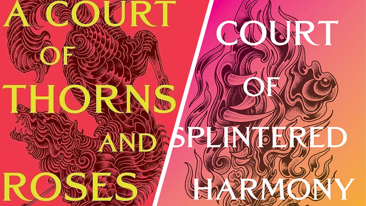
(Image credit: Bloomsbury Publishing) Copy link Facebook X Whatsapp Pinterest Flipboard Email Share this article 0 Join the conversation Follow us Add us as a preferred source on Google Newsletter Subscribe to our newsletter A Court of Thorns and Roses author Sarah J. Maas has revealed the titles and book covers for the 6th and 7th instalments of her wildly popular romantasy saga, and fans are divided. The new candy-coloured aesthetic is a dramatic departure from the previous novels, suggesting an unexpected turn in the scandalous series.I've been quite opinionated about romantasy book cover design in the past, so seeing Maas divert from her usual broody jewel-toned aesthetic has me torn. On one hand, it's great to see romantasy book covers divert from the trends. On the other, I don't know if this is the direction I'd hoped for.A post shared by Bloomsbury Publishing (@bloomsburypublishing)A photo posted by on Taking to Instagram, Maas shared the upcoming ACOTAR titles A Court Of Splintered Harmony and A Court Of Forgotten Melody. Set to arrive in October 2026 and January 2027 respectively, the new instalments will follow the Valkyries, an ancient clan of fierce female warriors, bringing us into the new Valkyrian Cycle Movement narrative arc.Latest Videos FromCreative BloqWatch full video here: Stories aside, the new book covers have proved divisive among the fandom thanks to their bright gradient design. While the ACOTAR series hasn't shied away from bright jewel-toned pinks and emeralds, the confident block colouring has become a signature of the covers. Featuring pink-yellow and turquoise-yellow gradient designs, the new covers have a playful, candy-coated look that feels like a rogue choice for the fierce Valkyrie era.Acotar covers be like: pic.twitter.com/LjkMvkvgwhAugust 18, 2026In the romantasy world, the ACOTAR series arguably features the most recognisable book cover design. Featuring intricate black illustration and the series' signature serif font, the new designs feel at home among the predecessors, but I find myself wishing for something a little more brooding – it's giving major 2016 Instagram vibes, and not in a good way. For more design news, check out why you need to stop being a book cover design snob or learn how to paint a book cover with these speedy tips.Get the Creative Bloq NewsletterSign up to Creative Bloq's daily newsletter, which brings you the latest news and inspiration from the worlds of art, design and technology. TOPICS Natalie FearStaff WriterNatalie Fear is Creative Bloq's staff writer. With an eye for trending topics and a passion for internet culture, she brings you the latest in art and design news. Natalie also runs Creative Bloq’s 5 Questions series, spotlighting diverse talent across the creative industries. Outside of work, she loves all things literature and music (although she’s partial to a spot of TikTok brain rot). View More You must confirm your public display name before commenting Please logout and then login again, you will then be prompted to enter your display name. Logout LATEST ARTICLES 1 Amazon's massacre of rare books is a betrayal of the brand's origins 2 Star Wars: Galactic Racer's podracing meets Burnout had me on the edge of my seat 3 The 5 best Android drawing tablets that we've tried and tested 4 I decoded the Camp Flog Gnaw lineup so you don’t have to 5 Some of my favourite earphones are now as low as $20 in this Back to School sale