This beautiful logo shows there's plenty of life in minimalist design yet
(Image credit: hasan & partners) Copy link Facebook X Whatsapp Pinterest Flipboard Email Share this article 0 Join the conversation Follow us Add us as a preferred source on Google Newsletter Subscribe to our newsletter Every creative has had that moment when you're staring at a blank page, waiting…
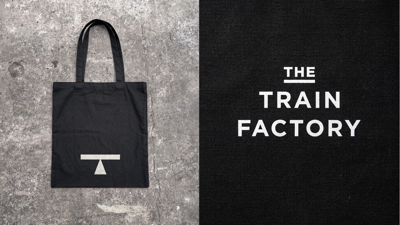
(Image credit: hasan & partners) Copy link Facebook X Whatsapp Pinterest Flipboard Email Share this article 0 Join the conversation Follow us Add us as a preferred source on Google Newsletter Subscribe to our newsletter Every creative has had that moment when you're staring at a blank page, waiting for inspiration to hit. When it comes to designing a brand identity, though, you don't really have any excuse. You just have to put in the right level of research into the client or project, and you'll soon find what you're looking for.That's exactly what creative agency hasan & partners did when they were approached by Train Factory, a new food, drink, sport and culture destination built inside a historic locomotive manufacturing site in Finland's capital, Helsinki.The site was once central to Finnish rail manufacturing; a place where the majority of the country's locomotives were built. That's a lot of history to carry, and some designers might have leaned on it too literally. Happily, the studio instead went the extra mile, and set out to look for something more specific.Latest Videos FromCreative BloqWatch full video here: Inspiration strikesThe essence of a place is often found in the small details, and so it proved here. Inspiration struck in the form of a small, unglamorous piece of industrial signage: a graphic used on the sides of train cars to indicate where the vehicle could be safely lifted during maintenance.It's the kind of symbol most of us would walk past a thousand times without registering. But for this rebranding project, it turned out to be the perfect foundation. They repurposed and redesigned this utilitarian mark into the brand's primary 'T' logo. (Image credit: hasan & partners) (Image credit: hasan & partners)It's a lovely bit of lateral thinking: a symbol whose entire purpose was mechanical and instructional, telling a crane operator exactly where to attach a hook, becomes the symbol of an entirely new kind of elevation: elevating a disused industrial site into a vibrant, bustling place for people to gather together for fun and friendship.Why this mattersThere's been a lot written in the last few years about the declining use of minimalist, geometric, sans-serif logos. Some of this by yours truly. And I certainly think that the tech world definitely has taken a design style that had a lot to offer and wrung it dry, by repeating it unvaryingly, across seeming every logo and redesign known to man.Get the Creative Bloq NewsletterSign up to Creative Bloq's daily newsletter, which brings you the latest news and inspiration from the worlds of art, design and technology.But that doesn't mean there's anything wrong with using clean, minimalist, geometric sans-serif typography in general. It's just a question of doing it unthinkingly, simply because it's "on trend", rather than using it because it's the right choice for the story you're telling. (Image credit: hasan & partners) (Image credit: hasan & partners)That's why this case study is such a great example of how to do utilitarianism right. This sans-serif wasn't picked off a shelf because it was what everyone else is doing. It evolved organically out of a graphic stencilled on train cars, and it carries the weight of that history in every squared-off letterform.In short, clean, minimalist sans-serif typography isn't dead, and nor should it be. It just needs a reason to exist. And in the case of The Train Factory, hasan & partners gave it one. TOPICS Tom May Freelance journalist and editor Tom May is an award-winning journalist specialising in art, design, photography and technology. He is the author of the books The 50 Greatest Designers (Arcturus) and Great TED Talks: Creativity (Pavilion). Tom was previously editor of Professional Photography magazine, associate editor at Creative Bloq, and deputy editor at net magazine. View More You must confirm your public display name before commenting Please logout and then login again, you will then be prompted to enter your display name. Logout LATEST ARTICLES 1 Zoner Studio (2026) review: all-in-one image editing with a splash of video too 2 Samsung Galaxy Book 6 Pro review: every inch the professional 3 iPhone 18 Pro preorders are open – here's how to get it for free 4 How I created a sense of scale, weight and halted motion in this epic serpent scene using Blender 5 I hate to say it, but the backlash to this beer company's rebrand is justifiedSource: Creative Bloq AI Art — Published — Category: Image AI